Asset Hierarchy
Mgmt. Platform
Bringing structure out of spreadsheets and into the system.
ROLE
Lead Product Designer
TIMELINE
8 Weeks (Strategy & Design)
TEAM
1 PM, 8 Engineers, 2 UXD
Case study overview (video summary)
Accessible video summary of the case study, offering an alternate format to the written content for easier consumption.


EXECUTIVE SUMMARY
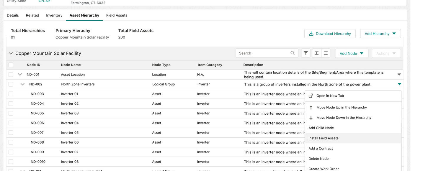
Asset hierarchies define how physical assets relate to each other—from site and zone down to systems and components. They are foundational to operations, maintenance, reporting, and failure analysis.
Before this project, asset hierarchies didn’t exist in the product. They lived in Excel.
I led UX strategy and design to move asset hierarchies from spreadsheets into a Salesforce-based system, under real constraints.
THE WORKFLOW SHIFT
Excel
Product
Field Execution
60%
Reduction
ad-hoc hierarchy nodes per quarter
20%
Increase
In field installation confidence
Zero
Dependency
On excel for reporting and operational source of truth
"This was not a UI feature — it was a structural change in how the organisation operated."
The World Before
Excel worked—until it didn’t.
Asset managers planned hierarchies in spreadsheets and shared them with field teams. Field engineers installed assets based on interpretation. Errors didn’t surface immediately; they appeared weeks later through broken reports, failed audits, or maintenance confusion.
The issue wasn’t carelessness. It was that structure existed outside the system, where it couldn’t be enforced.
Excel captured intent, but once work moved into the field, that intent evaporated.

Documentation without enforcement creates false confidence.
Understanding the Work Before Designing Anything
Because this was a zero-to-one capability, we didn’t start with screens.
I spent time understanding how hierarchies were actually created, interpreted, and broken:
How asset managers structured Excel sheets
Where assumptions replaced clarity
How field engineers interpreted them on site
Where mistakes became irreversible
This revealed something important: hierarchies were often completed during installation, not planning. Field engineers thought in physical terms — site, zone, equipment — while spreadsheets thought in abstract trees.
The problem wasn’t missing UI. It was a mismatch of mental models at the moment decisions were made.
You can’t design hierarchy UX without understanding execution reality.
Where Things Broke
As the number of sites and assets grew, the cracks became impossible to ignore.
Assets were installed at incorrect hierarchy levels. Naming drifted across sites. Maintenance plans referenced the wrong systems. Reports stopped telling a consistent story. Operations teams quietly stopped trusting the data.
One pattern stood out clearly:
"Hierarchy errors didn’t happen during planning. They happened during execution."
The most dangerous moment wasn’t when hierarchies were defined — it was when assets were installed, with no system feedback.
The highest-risk decisions were happening outside the product.
Guiding the Team Through Ambiguity
At this point, ambiguity was high. Designers wanted to visualise the hierarchy. Product wanted flexibility for different sites. Engineering was worried about Salesforce limits and performance.
My role was to slow the team down and change how we approached the problem. Instead of starting with UI patterns or competitive research, I guided the team to:
Map the full workflow end-to-end
Identify where mistakes actually occurred
Keep what already worked (bulk creation, templates)
Remove flexibility that caused long-term damage
I repeatedly brought the conversation back to one question:
"What decision is the user making right now — and what happens if they get it wrong?"
Once we aligned on that, design debates became much clearer.
Ambiguity faded once we anchored on decisions, not visuals.
The Strategic Shift
(and Why We Stopped Our Initial Approach)
Early on, the obvious solution was to “just show the hierarchy.” A tree. Expand, collapse. Something familiar.
That direction didn’t survive contact with reality. On Salesforce, rendering more than ~5,000 nodes degraded performance or crashed the browser. Recursive queries hit platform limits. Drag-and-drop trees looked good in demos but collapsed at real data volumes. On mobile, they were unusable.
This was the moment I pushed the team to stop designing for visibility and start designing for safety.
KEY TAKEAWAY
If the system can’t scale safely, the UX is already broken.
The Reframe That Changed Everything
"How do we show the hierarchy?"
"How do we help users make the right decision inside a hierarchy they’ll never fully see?"
From that point on, the hierarchy stopped being something to browse and became something to respect.
KEY TAKEAWAY
At scale, UX is about decision safety, not visibility.
Leading Through Tensions and Trade-offs
This shift surfaced real tensions. Product pushed for configurability. Engineering pushed back on performance risk. Designers initially wanted a “better tree” because it felt intuitive.
I reframed these debates around risk, not preference:
Which mistakes are reversible?
Which ones corrupt data long-term?
Who bears the cost when things go wrong?
This led to hard decisions: No full hierarchy trees, no drag-and-drop at scale, and no free-form edits in the field.
Some of my own ideas didn’t survive testing. I initially supported more flexible field edits, but user testing showed they reintroduced Excel-like ambiguity. We cut them. The system improved.
Leadership here meant protecting the system — even from our own assumptions.
What We Ultimately Built
Workflow 1: Designing Interaction at Scale
Instead of trees, we designed contextual slices:
Breadcrumbs to show location
Parent + immediate children only
Counts and metadata for deeper levels
Search as the primary navigation
Users interacted with dozens of nodes — never thousands.
Creating Hierarchies Across Sites
Hierarchy creation was standardised through templates: Allowed levels and depth, naming rules, and locked vs flexible zones.
When new sites or projects started: Templates generated skeleton hierarchies, bulk creation via tables or Excel import, and validation before activation.
Excel remained an input — never the source of truth.
Workflow 2: Field Installation
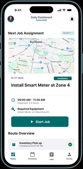
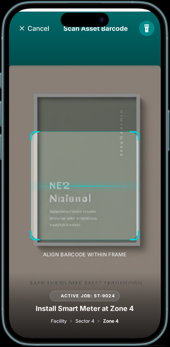
On mobile: Only valid install locations were shown, invalid placements were blocked, context appeared just-in-time, and offline workflows were supported.
There was initial resistance. Restrictions felt limiting. I addressed this by grounding discussions in real incidents where a single wrong placement caused weeks of cleanup. Once teams saw the guardrails as protection, resistance dropped.
Speed didn’t decrease. Rework did.
Guardrails reduced friction over time, not increase it.
Team Growth
Over the course of the project, the team matured noticeably.
Designers shifted from UI-first thinking to systems thinking. Critiques moved from “this feels restrictive” to “this feels safer.” Engineers became proactive partners in UX decisions. Product conversations became about risk and outcomes, not features.
I encouraged pushback — including against my own ideas — and treated being proven wrong as progress, not failure.
The system wasn’t the only thing that scaled — the team did too.
What I Learned
This project reinforced that:
01
Scale is a UX constraint, not just a technical one
03
Guardrails build trust when grounded in real workflows
02
Hierarchies are operational infrastructure, not navigation
04
Saying “no” early prevents expensive fixes later
"Trust is the real UX outcome in complex systems."
What I Would Do Differently
I would bring engineering constraints into design conversations even earlier, prototype constraint-driven flows sooner, and socialise the why behind guardrails more proactively with stakeholders.
Earlier alignment would have reduced churn and accelerated confidence.


