
Database
Management
Designing clarity when everything is on fire.
ROLE
Lead Product Designer
TIMELINE
8 Weeks (Strategy & Design)
TEAM
1 PM, 8 Engineers, 2 UXD
Case study overview (video summary)
Accessible video summary of the case study, offering an alternate format to the written content for easier consumption.


33%
Faster Response
faster incident response times
22%
Fewer Escalations
fewer critical escalations
High
Confidence
Greater confidence and trust during on-call scenarios
This case study shows how I lead UX — through problem reframing, research-driven decisions, team enablement, intentional trade-offs, and outcomes that matter.
EXECUTIVE SUMMARY
When enterprise systems fail, speed alone doesn’t solve the problem. People need clarity to make the right decision under pressure.
I led UX strategy and execution for a database management platform used during live system incidents. What initially appeared to be a request to “improve visualisation” revealed a deeper issue: teams were relying on powerful third-party monitoring tools, but lacked a unified way to assess risk, decide confidently, and act safely when it mattered most.
By designing a decision layer on top of fragmented tools, grounding the work in real incident workflows, aligning product and engineering around clear principles, and growing designers alongside delivery, we achieved:
The World I Stepped Into
There was no single product experience when this work began.
During incidents, database administrators jumped between multiple third-party monitoring tools, internal logs, command-line utilities, and runbooks. Each tool was valuable on its own, but none were designed to work together.
In practice, this meant administrators had to manually stitch together context, judge severity from experience, and make high-risk decisions under pressure.
The challenge wasn’t fixing a UI. It was bringing structure to chaos in real time.


The challenge wasn't UI Polish- it was lack of structure across tools
What Was Breaking
As I observed real incidents and walked through past outages, a clear pattern emerged.
People weren’t struggling to find data. They were struggling to trust their decisions.
The questions they kept asking were:
“Which alert actually matters right now?”
“How severe is this, really?”
“What’s the safest next step?”
Because every tool spoke a different language, hesitation crept in. Escalation became a safety net—not because systems were failing, but because confidence was.
The platform was built for monitoring. The users needed decision support under pressure.

The existing system to manage the database.
Escalations were driven by uncertainty, not system failure
Understanding the Work Before Designing Anything
Before jumping into solutions, I focused on understanding how decisions were actually made during incidents.
Through incident walkthroughs, on-call observations, and conversations with DBAs and operations leads, we mapped the real workflow:
An alert fires in a monitoring tool
Signals are checked across multiple systems
Context is manually correlated
A decision is made—to act, wait, or escalate
The breakdown consistently happened between context gathering and decision-making.
To keep the team focused, we aligned on one primary persona—the on-call DBA—and three core jobs to be done:
01
Assess system health quickly
02
Decide the safest next action
03
Communicate system state, not just raw data
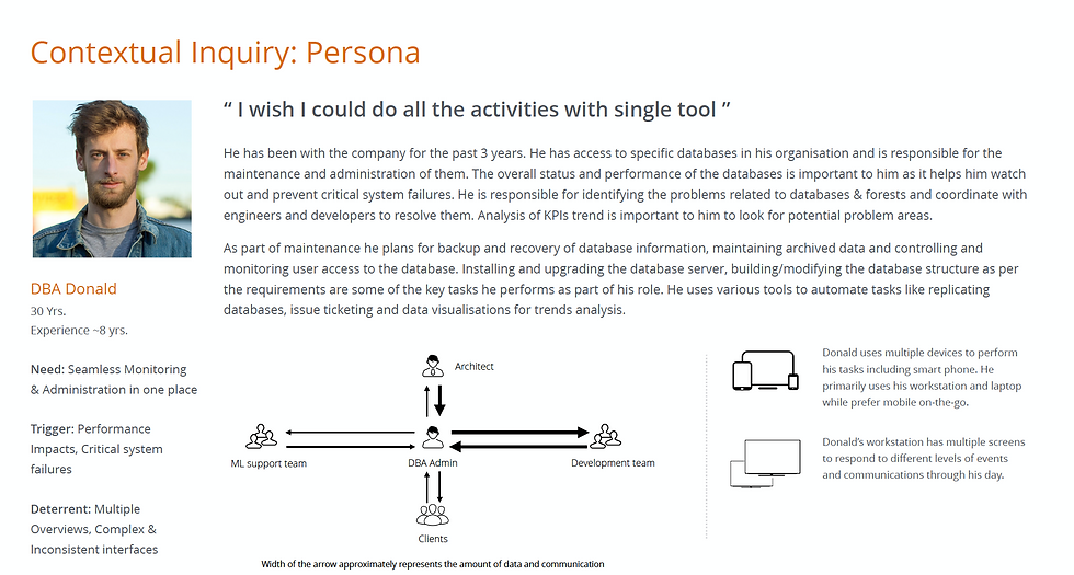
DBA Persona
The "Decision Moment" became the design focus.
Guiding the Team Through Ambiguity
A big part of my role was helping designers navigate uncertainty without over-designing solutions.
Instead of starting with competitive audits or visual inspiration, I guided the team to:
-
Map the existing ecosystem of tools and signals.
-
Identify what already worked and keep it intentionally.
-
Discard anything that added noise without improving decisions.
Whenever discussions drifted toward "fancy UI, our competitors do X and lets have this feature" I brought the team back to one question:
“What decision is the user trying to make right now?”
Focusing on jobs-to-be-done and workflows helped the team rely on common sense over design trends and feature parity. Once the workflow made sense, the UI followed naturally.


Common sense and JTBD cut through ambiguity faster than competitive research
The Strategic Shift
This work led to clear reframing with Product and Engineering:
We weren’t building another monitoring tool. We were designing how decisions should be made when systems are under pressure.
We aligned on three principles:
01
Communicate system state, not raw data
02
Place context at the moment of decision
03
Treat cognitive load as a real constraint
Leading Through Tension and Trade-offs
As the direction solidified, tension surfaced.
Product wanted feature parity and broader reach. Engineering prioritised ease of implementation, safety and edge cases. UX pushed for fewer, clearer decision paths.
I reframed conversations around risks, grounding decisions in real incident examples. This helped the team align on a shared priority:
Safe decisions first. Extensibility second.
Even my own ideas were challenged. An early concept to collapse alerts into a single health score was tested and replaced with a tiered severity model—fast clarity with optional depth.
The solution was better because it wasn’t owned by one discipline.
What We Ultimately Built
The final experience wasn’t a visualisation dashboard. It was a decision-first product.
Alerts communicated severity, likely cause, and recommended actions. Critical metrics and events appeared directly within alert flows. Common remediation actions could be triggered without context switching.
Every screen answered one question:
What should I do next, and why?
DESKTOP EXPERIENCE
The Command Center
For deep investigation and root cause analysis, the desktop interface provides a high-density, low-noise environment. Alerts are prioritised by impact, and relevant logs are automatically surfaced to reduce search time.


MOBILE EXPERIENCE
On-Call Companion
Incidents don’t always happen when you’re at your desk. The mobile experience focuses strictly on triage: acknowledging alerts, checking system vitals, and executing safe, pre-approved remediation actions while on the move.


The Impact
-33%
RESPONSE TIME
-22%
HIGH LEVEL ESCALATIONS
01
INTEGRATED APP FOR ALL DBA NEEDS
DBA, ON_CALL ROTATION
"
In production, I can tell within a few seconds whether the system is at risk and what I should do next. Earlier, I had to open multiple dashboards before feeling confident.”
The numbers mattered. The calm mattered more.
Reflections
What I Learned
•
Decision clarity often matters more than feature depth
•
The strongest outcomes emerge when leaders invite challenge
•
Growing people scales impact beyond any single project
•
Constraints force focus on what truly matters
What I’d Do Differently Next Time
•
Establish baseline metrics earlier
•
Involve operations leaders sooner
•
Expand scenario testing upfront
•
Build post-incident feedback loops into the product
The direction wouldn’t change — but the execution would be sharper.
When users are under pressure, clarity becomes the product.
PREVIOUS
Fintech App
Mobile Banking Redesign