Database Management Platform
A desktop and mobile experience designed to help teams monitor, diagnose, and stabilize high‑risk data systems with confidence.


Context & Scope
TEAM
2 Designer, 7 Engineers
MY ROLE
Senior Product Designer
TIMELINE
3 Months
(2022)
TOOLS
Figma, Jira, Miro
The Problem
Operational teams struggled to assess risk and act safely during incidents. Poor visibility, limited context, and mixed‑risk controls increased time to resolution and raised the likelihood of production errors—especially in on‑call and mobile scenarios.
My Contribution
I led the end‑to‑end UX across desktop and mobile—defining Jobs To Be Done, shaping incident‑response workflows, and setting clear safety boundaries. I partnered closely with product, engineering, and operations to align design decisions with real operational risk.
Overview
This platform supports mission‑critical database systems where availability, performance, and correctness are non‑negotiable. Administrators operate under time pressure, often during incidents with direct business impact.
THE OUTCOME
A role‑aware admin experience that delivered measurable improvements
-33%
Incidence response time
-22%
Reduction in high level escalations
Discovery & Research
We studied how teams behave during real incidents, focusing on decision-making rather than feature usage. What is their actual environment and real world conditions
8
STAKEHOLDER
INTERVIEWS
3
SITE
VISITS
2 Weeks
VIRTUAL
RIDEALONGS
The Environment
Production Pressure
Mission‑critical systems with strict uptime expectations. Incidents often occurred during on‑call hours, with limited time to assess risk and act safely.
Fragmented Tooling
Admins relied on multiple dashboards, logs, and monitoring tools to understand a single issue, slowing diagnosis and resolution.
Limited Mobility
Mobile access was restricted to basic alerts, forcing admins to either wait for desktop access or act without sufficient context.
Research Insights
Monitoring lacked visual signal, Admins had to mentally interpret numbers instead of immediately recognizing risk.
The platform exposed data, but not status. Admins could see memory, CPU, or ingestion metrics, but not whether the system was healthy, degraded, or at risk.
Metrics, logs, and alerts lived in isolation. Admins manually stitched together information across screens to understand cause and effect.
With few visual hints or recommendations, resolving issues depended heavily on senior admins’ prior knowledge rather than system support.
THE STRATEGY
Make risk visible. Make action safe.
Our focus was simple: help admins understand what state the system is in, what matters right now, and what they can safely do next—especially under pressure. Instead of adding more controls, I designed the experience to reduce uncertainty and support better judgment.
Make system health obvious.
Keep mobile for stabilizing, desktop for fixing
Recommend actions, but keep admins in control.
User Persona
Based on the research and synthesis we came up with a DBA persona.
The new database workflow
Fix Database Issues Without Leaving the Alert
01
Alerts
Alerts arrive with severity, impact, and cause summarized upfront, eliminating guesswork and false urgency.
02
Review Inline
Critical metrics, recent changes, and related events are visible inline, allowing confident assessment without leaving the alert.
03
Act & Stabilise
Common recovery actions are completed directly from the alert, reducing response time and preventing escalation.
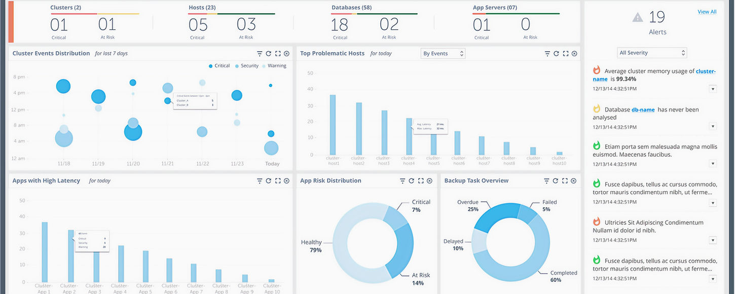
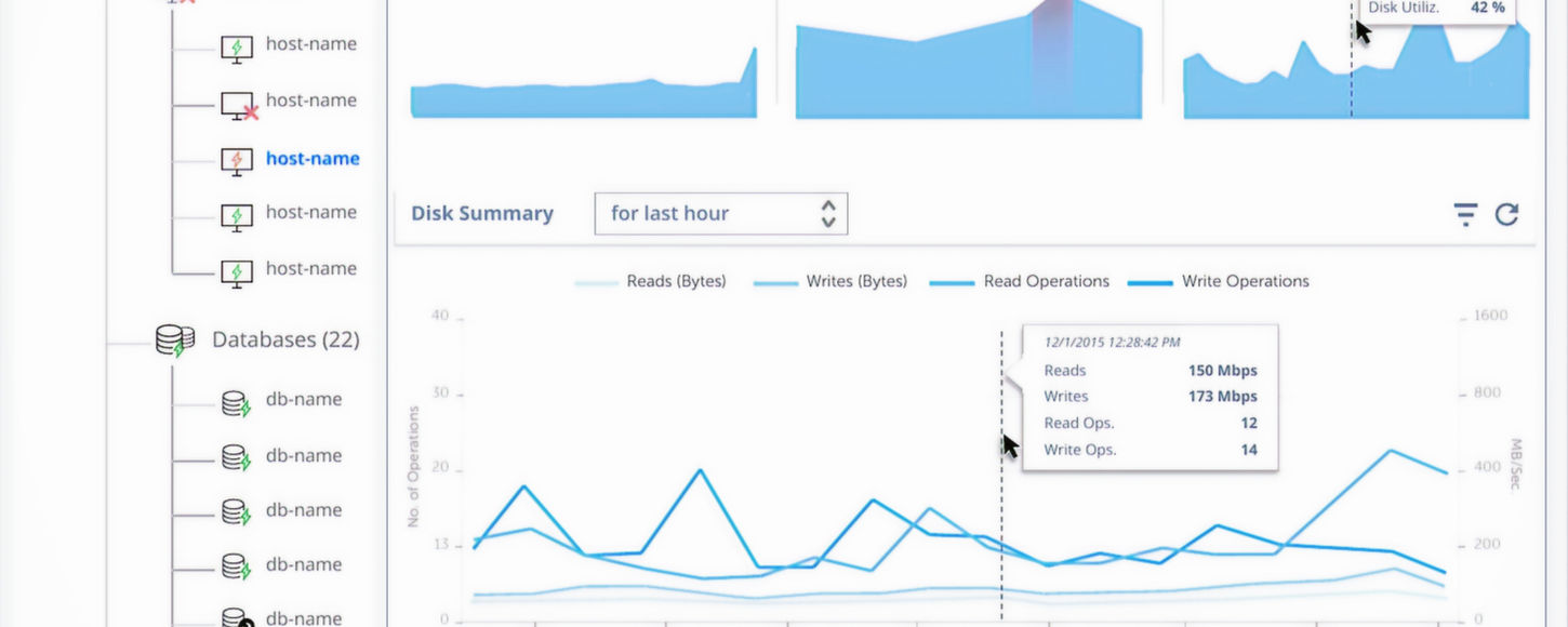
THE NEW DESKTOP EXPERIENCE
See more. Act faster.
Manage data with confidence.
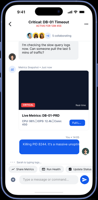
MOBILE EXPERIENCE
Designed for quick checks and fast action.
Experience the Mobile workflow
Static screens can only tell half the story. We built high-fidelity prototypes to test the physics of our flow & interactions.
Validation & Testing
Before rollout, we ran 2 rounds of moderated usability testing with DBAs and on-call engineers using realistic incident scenarios (memory pressure, ingestion failure, degraded performance).
The goal was to validate comprehension, decision-making, and confidence — not speed or efficiency alone.
Task Completion (With Confidence)
Jumped from 6/10 to 9/10
Backtracking / Screen Switching
Reduced from 4–5 screens → 2–3 screens per task
Testing Feedback
“I don’t have to figure out whether this is serious anymore. The screen tells me that before I even start looking around.”
DBA, USABILITY TESTING
"Earlier I kept checking other views to make sure I wasn’t missing something. Here I feel comfortable choosing an action and moving on."
Senior DBA, moderated testing
The Impact
-33%
RESPONSE TIME
-22%
HIGH LEVEL ESCALATIONS
01
INTEGRATED APP FOR ALL DBA NEEDS
DBA, ON_CALL ROTATION
"
In production, I can tell within a few seconds whether the system is at risk and what I should do next. Earlier, I had to open multiple dashboards before feeling confident.”
What I Learned
System state beats raw data
Admins don’t lack metrics—they lack clarity. Clear health states help them understand risk instantly without mental math.
Mobile builds confidence
On mobile, admins want to orient themselves and act safely. Full control belongs on desktop, not in urgent contexts.
Safety is part of UX
Guardrails and confirmations actively prevent mistakes and increase trust during high‑risk, high‑pressure moments.
Guidance scales teams
When actions explain why they’re recommended, teams rely less on tribal knowledge and senior escalation.
UX Design can potentially changes behavior
Reducing noise and ambiguity leads to steadier decisions and more predictable operations under pressure.


